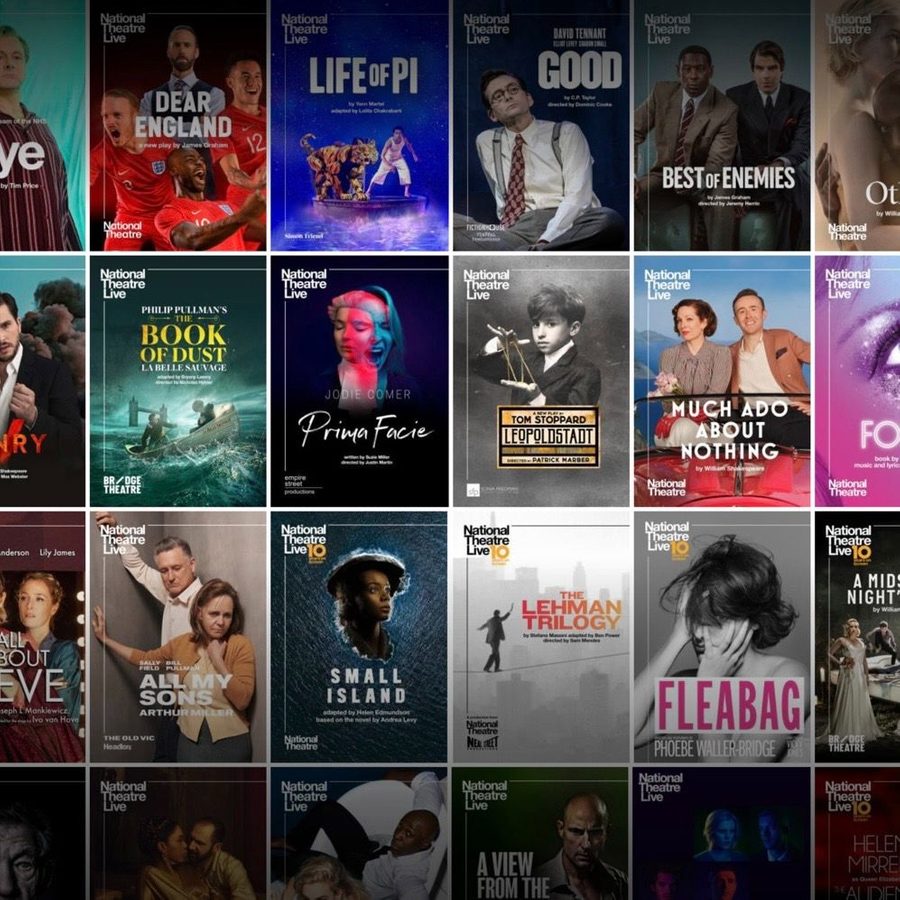
The Art of National Theatre Live: Posters that take the spotlight
Posted

We asked the team behind National Theatre Live, as well as cinema staff and our brand ambassadors, to tell us their favourite NT Live artwork and why it speaks to them.
With many eras of NT Live artwork and 100 shows released in cinemas over the past 15 years, there’s certainly plenty to choose from! Here are our top picks…
Our top picks

Vanya (2024)
Jess Windall, Cinema Distribution and Marketing
‘Really gorgeous artwork that captures all the emotions of the play. Highlights the sense of solitude at its heart, and just a really striking image! It’s amazing how Andrew Scott‘s expression encapsulates so many of the play’s characters in one.’

Dear England (2024)
Eddie Smith, Graphic Designer
‘My favourite would have to be the Dear England artwork that was created especially for NT Live! It has a real sense of energy and highlights Joseph Fiennes in full Gareth Southgate mode.’

Life of Pi (2023)
Rebecca Winkler, NT Live Brand Ambassador
‘The blue of the starry night is very eye catching. I also love how you can tell this is a scene from the actual play. I love when puppetry is used in theatre, and I think showcasing it in artwork can help draw people in too. It’s also striking because you don’t often see tigers and humans together so you would almost have to do a double take to see what it is advertising.’

The Crucible (2023)
Amy Fleming, NT Live programming team
‘Love posters that tell stories. I think this design really encapsulates the tone of the show and I think if you didn’t know the show at all, this poster gives a real sense of what to expect! I love that as the viewer you feel as though you are being accused by this group of girls and feel totally surrounded by them even though it’s in 2D. You get a real feeling of the power that they hold. The cool colour scheme also adds to the unnerving feeling too. I could go on, but I think it’s superb!’

Much Ado About Nothing (2022)
Ollie Gardner, Producer
‘The beautiful car mapped in front of the painted backdrop perfectly set the tone for Simon Godwin‘s production which transported us back to the Italian Riviera in the 1930’s. The poster feels like an homage to the retro Italian tourist posters you used to find.’

Who's Afraid of Virginia Woolf? (2017)
Toby Connell-Cooke, Marketing
‘It’s dramatic and cinematic, a perfect artwork for NT Live’s crossover between the worlds of theatre and cinema. Each of the four powerhouse actors (including the NT Live favourite Imelda Staunton) encapsulates such vivid emotion, against a slick grainy backdrop representative of Edward Albee‘s era. This was also one of my first visits and favourite productions released by NT Live.’

Jane Eyre (2015)
Caroline Hennigan, Cinema programmer, Broadway Cinema Nottingham
‘That’s so hard! But I think my favourite is Jane Eyre; it’s so visually arresting and it captures the themes and passion of the heroine so well.’

A Small Family Business (2014)
Sana Khan, NT Live Brand Ambassador
‘I chose this artwork because it immediately grabs attention with its bold colours. It also cleverly tells a lot; the man sitting confidently on a pile of precarious objects, surrounded by falling money, perfectly captures the play’s themes of business, greed, and the unstable balance between success and moral compromise. The chaotic energy of the scattered money reflects the tension and instability in the story, making this artwork a great visual representation of the play’s underlying conflicts. It’s both eye-catching and thought-provoking.’

Frankenstein (2011)
Michael Rogers, Cinema programmer, ODEON
‘I love the NT Live Frankenstein poster with its striking minimalist design, contrasting colours, and haunting imagery. It captures the story’s themes of duality and creation perfectly, evoking both sympathy and horror.’

The Importance of Being Earnest (2025)
And last but not least, presenting the artwork for our upcoming release The Importance of Being Earnest, in cinemas worldwide from 20 February 2025.